Aug 2, 2023
Seven years ago, NAATP was faced with the challenge of having to rebrand ourselves as a legitimate resource for addiction treatment providers. New to the organization, CEO Marvin Ventrell and COO Katie Strand enlisted the help of designRoom, a branding and design agency dedicated to helping their clients maximize their full potential. Marvin and Katie reflect on this process with designRoom Creative Director, Chad Gordon. This blog post was originally published by designRoom on July 11, 2023.
BEFORE
For a designer, creating a logo and visual identity for a client is a labor of love. It is like giving birth (without the labor pains). You create something from a blank slate. You shape it. You give it a unique voice. You give it color and personality. You give it guidelines to follow. You nurture it to the best of your ability so that it can succeed when released into the wild.
And then you have to let it go. One day you’re kerning the logotype, and the next you are dropping it off at college. That’s a bittersweet day, but you’ve done all you can do. Your baby is leaving the nest. It’s up to the client to take the logo to its full potential—to make it stronger so that it can stand out on its own in a crowded world.
When we deliver a brand identity system, the components are handed over to the client’s internal marketing team. This period right after hand-off is always the most perilous. It can go wrong quickly and continue to spiral out of control if not managed.
A successful hand-off
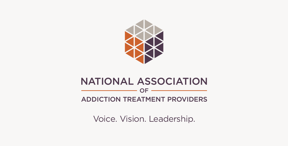
In 2016, the National Association of Addiction Treatment Providers (NAATP) came to us looking to give new life to their brand. “The association, four decades into its existence, had a reputation and relevance problem,” Marvin Ventrell, CEO, tells us. “That happens with organizations. It’s emblematic of the challenge of growth, and successful organizations never stop growing. The challenge of leadership is the saying, ‘everyone wants progress, its change we don’t like.’ So our job was to make NAATP relevant again.” He explained that the goal of the rebrand was “to professionalize the association as a companion piece to the professionalization of the addiction treatment industry. Just as treatment continued its evolution from social recovery programs to healthcare, moving from avocation to vocation, so too we had to evolve into a professional healthcare leadership association.” Ventrell further explained, “and so we needed a new brand to reflect that. For us then rebranding was not just a new look, it was a visualization of a new way. A brand is not just a picture.”
Katie Strand, COO, adds, “Next, for a 40-year-old organization, we asked ourselves, how do we retain our legacy of so much that is good and valuable, and let go of the other parts.”
After an initial assessment—probably the most critical part of the process—all parties agreed that the NAATP brand needed an overhaul for multiple reasons:
- New leadership brought a clearer focus to the organization as a whole. Ventrell continued, “But we did not lose sight of the gift that was given to us by a wise and dedicated board of directors. At one level, our job was simple, if not easy: define and deliver our value, the members’ ROI, and do so while demonstrating our historic value system. That starts with strategy, moves to building capacity, and then implementation, product delivery.” It was a classic example of, let's start with a strategic plan because the field is in disarray and somebody needs to lead it, and there's nobody else with our role or capacity.”
- They wanted to elevate the brand so that it would be recognized as THE national organization for addiction treatment providers. The brand had become dated and stagnant over time. There were issues with how people said the name, and moreover, what NAATP actually stood for.
- A tumultuous industry landscape: Members of NAATP reported multiple challenges for their organizations that include hurdles regarding topics such as reimbursement; benchmarking; uncertainty regarding treatment protocols that will be accepted in the future; recruiting clients and qualified talent; ethical misconduct across the sector; and the ability to influence policy to ensure best practices across the industry. NAATP not only needed to play a critical role in defining solutions, they also wanted to lead the efforts on a national level.

We were able to create a brand identity that addressed these issues and strongly resonated with leadership. “Leadership has to do its job and things trickle down from there,” says Marvin. “It has to start with the leadership. If a team exhibits poor sportsmanship , there’s a problem with the coach. I believe this strongly.” Leadership was invested and involved in every step of the creative process. Because of that, the exuberance and understanding of the new brand was embraced by staff as well as their audience. The package in this case was fairly simple—a new logo, tagline, stationery, brand guidelines and a launch presentation deck for the Board. NAATP took over the reins from there.
AFTER
When we handed off the new brand, the stakes were high. “We really had to stick with [the brand guidelines we were given],” says Katie. “We launched the website right before the Florida Conference. So, everything at that first conference with Marvin and I was all the new brand, and we went big on the visual.”
The hand-off doesn’t work if what we are handing off is insufficient. This part is on us, as branders. A branding firm will provide you all the necessary tools in order to effectively launch the brand and utilize it consistently, and also to allow for planned growth as the organization evolves. NAATP was able to hit the ground running with the tools we provided.
A good hand-off has four key features:
- Leadership: Company leaders support and understand the change and strategic direction they want to pursue, and help position the launch of the new brand.
- Communication: Staff has to be included in the change and remain informed about why there’s a new brand identity. We don’t do rebrands without the staff knowing, because they’re part of our initial assessment process. Being included in the rebrand keeps employees engaged, and a well-communicated launch will help ensure the rebrand lives on.
- Brand management: You need someone who understands the big picture—overseeing all internal and external marketing components and remaining in line with the brand guidelines so staff doesn’t go rogue with fonts they think look better, add their favorite colors, use the wrong style of imagery and so on.
- Consistent use: Yes, it has happened where we have created a new brand or rebrand, and it just sits on a shelf or is timidly introduced. In today’s world when there’s so much content out there, consistency is key in engaging and maintaining an audience.
The result, eight years later, is that NAATP is a thriving association with dramatically increased membership, revenue, product, and influence. Marvin tells us that this success came from something special that happened in the form of Chief Operating Officer Katie Strand. As CEO I needed a strong partner in leadership and I got one. We were a coordinated unit from the start. "If it weren't for the synchronicity of Katie and I understanding and fulfilling these roles, this wouldn’t have happened…You have to have a couple of people who clearly understand and are unwavering in their unified effort; it has always been synchronous with Katie and me. I’ve been a professional for nearly forty years as a trial lawyer, a law professor, an association director, and a treatment executive and I’ve never had it this good. She’s special.”
Taking over and taking it to the next level
A new brand is often out of our hands once we pass it off to the client. We’ll take a peek every now and then to see how they’re doing, and sometimes it’s…not good. Other times, as in the case with NAATP, they thrive with it. They continuously and successfully take it to the next level.
Marvin attributes this partially to the maturity of the brand. “It has matured. I think what's happened is that we grew into it. We matured our message. We evolved. There’s a saying in recovery, ‘What sustained you in your recovery last year will not sustain you this year.’ That's not criticizing what sustains you. It's saying you have to grow. You can never, ever rest on your laurels.” He goes on to say, “The nice thing about our business is that it's not a stretch to say what we ask of individuals in their recovery is the same thing we ask of our association.”
Activating the whole brand

I often talk about activating your visual identity. What that means is taking the core elements of your visual brand (your colors, shapes from the logomark, fonts, etc.) and using them as design elements throughout all communications, either statically or through animation. This creates depth and energy and visually reinforces your brand in order to make it more immediately recognizable, memorable, and an enhancement to your brand personality. It’s not easy, and it’s very easy to go overboard. It requires a designer or someone with a strong design sensibility. Otherwise, you can easily shift visual hierarchy by overpowering the logo with too much color, layering too many graphics and images, or just plain over-designing.
“I think some people…may not understand what a brand really means,” Katie says. “They associate it with just a logo, but it's so much bigger than that…It’s that education piece that needs to be considered.” To that end, activation is an ongoing challenge. Consistency is still key. Remember, YOU will get tired of your brand way before your audience does. So beware of making major changes out of boredom. “I became tired of [the colors] and I'm glad we had a secondary palette which we have moved to, and it's morphed and changed throughout. And as we have more staff, [the brand] has been handed off now, but trying to keep the look and feel while branching outside of it. I think the transition was smooth, and your team was great. And now we've just taken it to another level.”

NAATP does this very successfully, which is very refreshing. As the original designer, I’m always excited when I see their communications to see where they have taken it, beyond what we were tasked to do, and beyond what we maybe thought it even could do. It’s certainly in good hands!
The most important part in all of this is that it continues to impact their organization, from rising membership to having a larger, more effective voice of leadership in the industry. That’s what it’s really all about anyhow.
Of those who may be doubtful of a rebrand, Katie says, “If you buy it and don't live it, if you're not connecting the message and you're not living the brand, then it is minimal in terms of its value. So you have to figure out what that means. There is a singular golden thread that runs through all of our work, and I've said it before. It's authenticity. Do we have a clear message and are we authentic about it and does it show?”
Marvin agrees. “The ultimate test of wellness, sobriety, and association growth is authenticity. Are you engaged in an authentic, no bullsh.. process?”
Sometimes, they do come home
Occasionally a previous client will come back a few years after implementing a rebrand. It can be for a simple tune up, realignment or maybe an awareness campaign or new initiative such as talent acquisition. And that’s ok. That’s fairly normal. A lot can happen for things to go a bit astray over time like changing leadership or staff, organizational growth or redirection, or simple internal boredom with the brand.
That’s why we are always here to help. And it’s always nice when the kids come home to visit, even when they bring their dirty laundry.
About designRoom
At designRoom, we make it our business to find real answers and create custom healthcare brands. We believe effective healthcare branding is grounded in research, directed by insight, and driven by strategy.
We love seeing how strategic branding helps the right clients find the right organizations and receive the right care. That’s been our focus for over a decade. Today designRoom is an award-winning, national branding and design firm, known for helping clients build and promote healthy, sustainable brands. And we are super proud of that.

Chad Gordon is the Creative Director of designRoom, overseeing the development of virtually every original design. Chad has a degree in photo illustration from Ohio University and studied photography in Edinburgh, Scotland. In 1991 he worked with Reuben and Company as a photo assistant before joining designRoom as a designer the following year. Chad has received numerous national awards, has shared in his team’s many Addy Awards, and has had his work published in several international design publications.